Run ❯
Get your
own Python
server
×
Change Orientation
Change Theme, Dark/Light
Go to Spaces
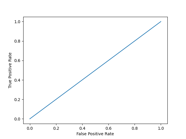
#Three lines to make our compiler able to draw: import sys import matplotlib matplotlib.use('Agg') import numpy as np import matplotlib.pyplot as plt from sklearn.metrics import accuracy_score, confusion_matrix, roc_auc_score, roc_curve n = 10000 ratio = .95 n_0 = int((1-ratio) * n) n_1 = int(ratio * n) y = np.array([0] * n_0 + [1] * n_1) # below are the probabilities obtained from a hypothetical model that always predicts the majority class # probability of predicting class 1 is going to be 100% y_proba = np.array([1]*n) y_pred = y_proba > .5 def plot_roc_curve(true_y, y_prob): """ plots the roc curve based of the probabilities """ fpr, tpr, thresholds = roc_curve(true_y, y_prob) plt.plot(fpr, tpr) plt.xlabel('False Positive Rate') plt.ylabel('True Positive Rate') plot_roc_curve(y, y_proba) print(f'model 1 AUC score: {roc_auc_score(y, y_proba)}') #Two lines to make our compiler able to draw: plt.savefig(sys.stdout.buffer) sys.stdout.flush()
model 1 AUC score: 0.5